Tuesday, 1 December 2015
Faithless 2.0 - Avicii Genre Magazine Advert Analysis
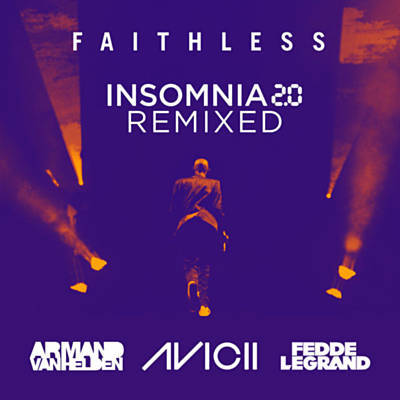
This magazine advert is for a remix, by Avicii, of Insomnia by Faithless.
It uses very bold colours to connote that the remix will be very bold and impressive. Apart from the main colour, purple, the reds and yellows used pay homage to the original music video, in which these were the only colours used - the rest of the video was in black and white.
The plain white colour of the text helps to make it stand out against the background.
The font for the '2.0' section connotes an alarm clock, which fits in with the theme of the song - not being able to sleep.
Having the original artist, Faithless, walking away in the picture, connotes that the old version of the song is leaving and it is time to listen to, and accept, the new version, by Avicii.
The stage lights either side of the original artist connote the location of a rave or nightclub scenario. This implies that the song will be good to dance to, which would make it popular among its target market.
Featuring the original artist's name and image on the cover implies that Avicii respects him and wants to make it clear that this isn't his original work. This helps to make the audience respect Avicii, as it shows that he isn't trying to rip off the original artist.
Analysing this magazine advert will help me when making my own, as t has shown me how colour and positioning can be used to connote a deeper meaning.
Subscribe to:
Post Comments (Atom)

No comments:
Post a Comment